Swiss Style Booklet
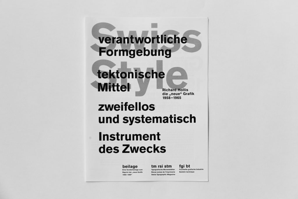
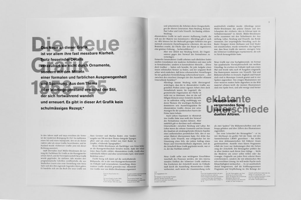
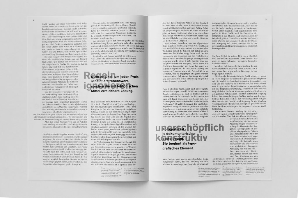
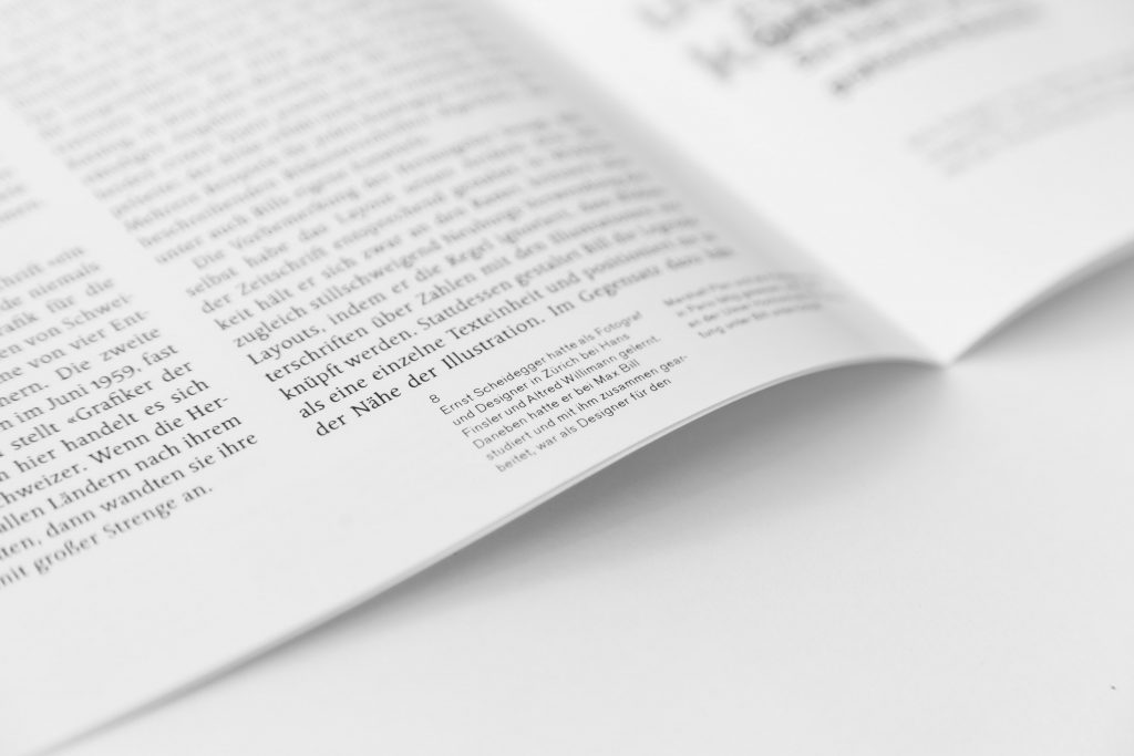
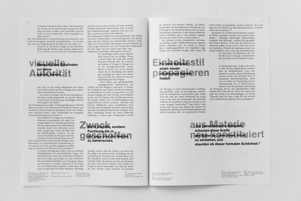
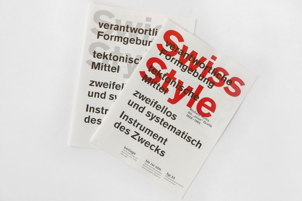
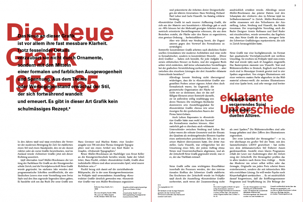
As a foundation we were given the scientific text by Richard Hollis about “die Neue Grafik” based on which I designed a brochure. (in English: Swiss Style)
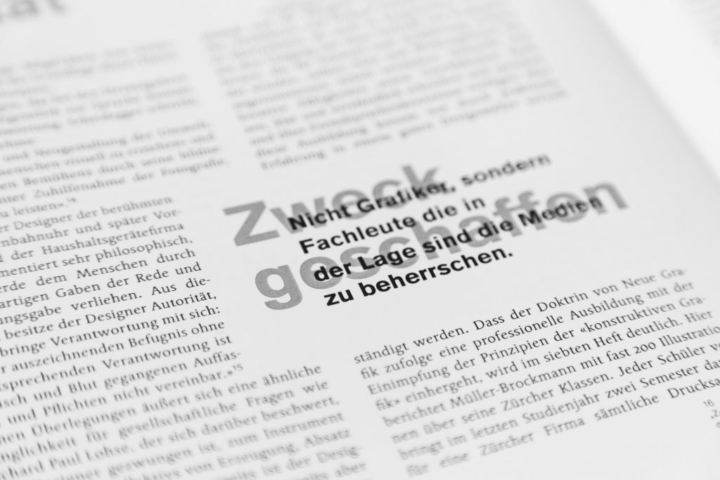
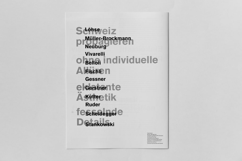
In this project I focused on statements. Quotes from the original text were linked with catch slogans. With the overlaying of these two different text information layers, a play between front and back was created.
Editorial
January 2014
ZHdK, Basic Module Text Design
